

How Your Menu Can Transform A Guest's Experience
A menu is much more than words on a paper, it can convey many things: personality, level of care put into each dish, and the type of experience you aim to deliver to your guests. A well thought out, easy-to-read menu is a marketing tool you should utilize to communicate with your guests already in your restaurant and attract new guests who are searching for a unique dining experience on your website. Transform your guest’s experience with these simple design ideas for your next menu.
Keep it Organized & Simple
Most guests have an idea of what they are looking for when they open your menu. If they don’t, they surely have an idea of what they like and dislike. The organization of a menu can guide your guest to easily find what they are looking for, and avoid making them feel overwhelmed.
Arrange the menu in a logical, or sequential way, making it easier for guests to identify specific items, or to locate which dishes they want to explore. By creating sections with corresponding menu items below, guests will easily be able to scan and land on a specific item. Just because your menu is well-organized, doesn’t mean it has to be mundane. Recipe developer and Food TV personality, Fanny Slater, suggests that “not all menus need to be broken down into boring categories. The flow of dishes should be clear, but you can also get creative.” The thing to remember is that “it’s all about shaping the list, says Slater, “so it’s easy to skim through so that diners can find what they are looking for.”
Your Guests Have Reading Patterns
Restaurateurs and menu designers have operated under the assumption that diners scan the menu in a zigzag pattern across the pages which led them to place their specialty items, or most expensive items in the upper, right-hand side of the page. There is now research that suggests that guests read your menu like a book, from top to bottom, starting on the left-hand page. Section six, in the figure below, is the perfect area to place your rotating, specialty, or high-margin menu items you’d like to market to your guests. By organizing your menu in this top-down pattern, with easy to read sections, you’ll encourage your guests to find the dish they are looking for or discover a new one.

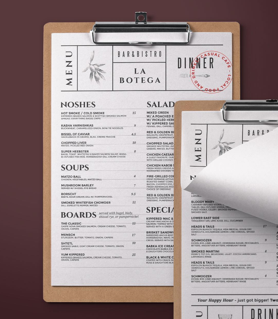
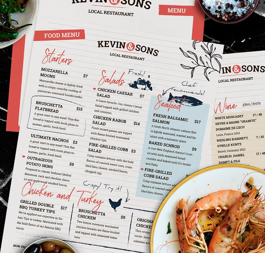
Use Imagery To Your Advantage
The quality of photos in your menu elevates your guest’s experience. A menu presented with very few pictures, but a detailed meal description embodies a more upscale restaurant, while the use of multiple photos can signify a chain-type or more standardized establishment. Be sure your menu design reflects the atmosphere and price point of your restaurant. If you are a high-end restaurant, you can add illustrations, borders or typography to develop a romantic, whimsical, or professional feeling.
You’ll also want to keep in mind those with food allergies or aversions. Iconography and annotations help guests that have specific dining needs to find items that best suit their dietary needs. Your staff and guests will appreciate the transparency and avoid serious health risks.

Be Particular with Typography and Spacing
Typography is a commonly overlooked aspect of menu design and reinforces brand cohesiveness, displays personality, and encourages readability. Menu design should choose a typeface that is clean and easy to read at different sizes. We suggest using two different typefaces to distinguish menu item names from meal descriptions. Keep the menu font size above 10 so that is not too small and avoids eye strain. You can balance font size and ample spacing will result in an uncluttered menu. Remember, white space or negative space, is your friend. A very cluttered or busy menu can cause the guest to become overwhelmed and confused. The menu should encourage the diner to make the best choice available while holding a conversation with friends, rather than read silently for 15 minutes prior to making a selection. If your restaurant would like to display variety and quantity, we encourage simplistic meal descriptions, clear categorization, and plenty of white space for readability.
Menu Item Names and Descriptions
Creativity can be a great asset when marketing your restaurant and menu, but getting too creative when it comes to menu item names can have a less than positive effect on a guest’s experience. While some might get a kick out of fun, cutesy names like The Tsunami Burger or The Mission A-Corn-Plished platter, some guests will avoid ordering these because of the embarrassment factor. Avoid corny names that guests might try to side-step.
When choosing a menu item guests will typically read the description to be confident that they are ordering something they will enjoy. Being straightforward with your menu item descriptions will enable you to deliver to your guest’s expectations. Allow the menu to communicate when the dish might be different than what is typically expected. Is the dish on the spicy side, served stacked, or with a different flavor base then is typical? Be sure to include this description in the menu. This will allow for transparency when ordering. If a guest orders something assuming one thing, but then being served another, it could lead to a negative experience or review. Transparency in the item description can also help to alleviate relying on your waitstaff to communicate notes directly to your guests after they have already ordered the specific menu item.
Your menu is an embodiment of your brand. Attention to detail can transform your guests’ experience for the better. If you have questions on how to strategically design your menu based on some of the ideas above, contact us. We’re happy to help!
Photos courtesy of Big Week Design and Jack’s Wife Frieda