

What is your brand palette?

When we talk about brand identity, color design is often one of the first elements we consider, but we don’t always think about it in the most productive ways. A strong brand palette is essential to not only brand identity but to secondary factors like consumer loyalty and maximizing marketing efforts.
When building a brand palette, there are questions that can help you narrow in on the best color scheme to move your business forward. In this quiz, we not only want to equip you with the right questions to ask but also help you frame your perception of branding to one that puts the focus on your customers to inspire growth for your brand and a fulfilling experience for them.
What kind of initial reaction do I want to inspire in customers?
First impressions are important, but they’re also fleeting. They aren’t about just getting people’s attention, either. Focusing on your customers’ initial reaction needs a good understanding of your ideal consumer their behaviors, and what they’re looking to get out of your product.
A brand palette that effectively communicates their need in the first few seconds is one that sets you up for success.
What kind of lasting impression do I want to leave?
First impressions are about onboarding customers and encouraging them to engage with your brand, but the impression they leave is often even more important than the one they come in with. A brand, at the end of the day, exists almost entirely in the consumer’s mind, because it is the sum of their experiences with you.
Colors that align with the impression you want to leave with your customer help facilitate recurring transactions and brand loyalty.
What emotional experience am I trying to curate while people engage with my brand?
Branding is 90% associations, so when curating your palette, think of the ways a customer will perceive it while they engage with your services. This relies on good customer service to be effective, but when that’s achieved, then the brand palette becomes a call back to good experiences.
Understanding the chain of events between a customer-first spotting your brand and after they leave is essential to helping you paint that experience appropriately.
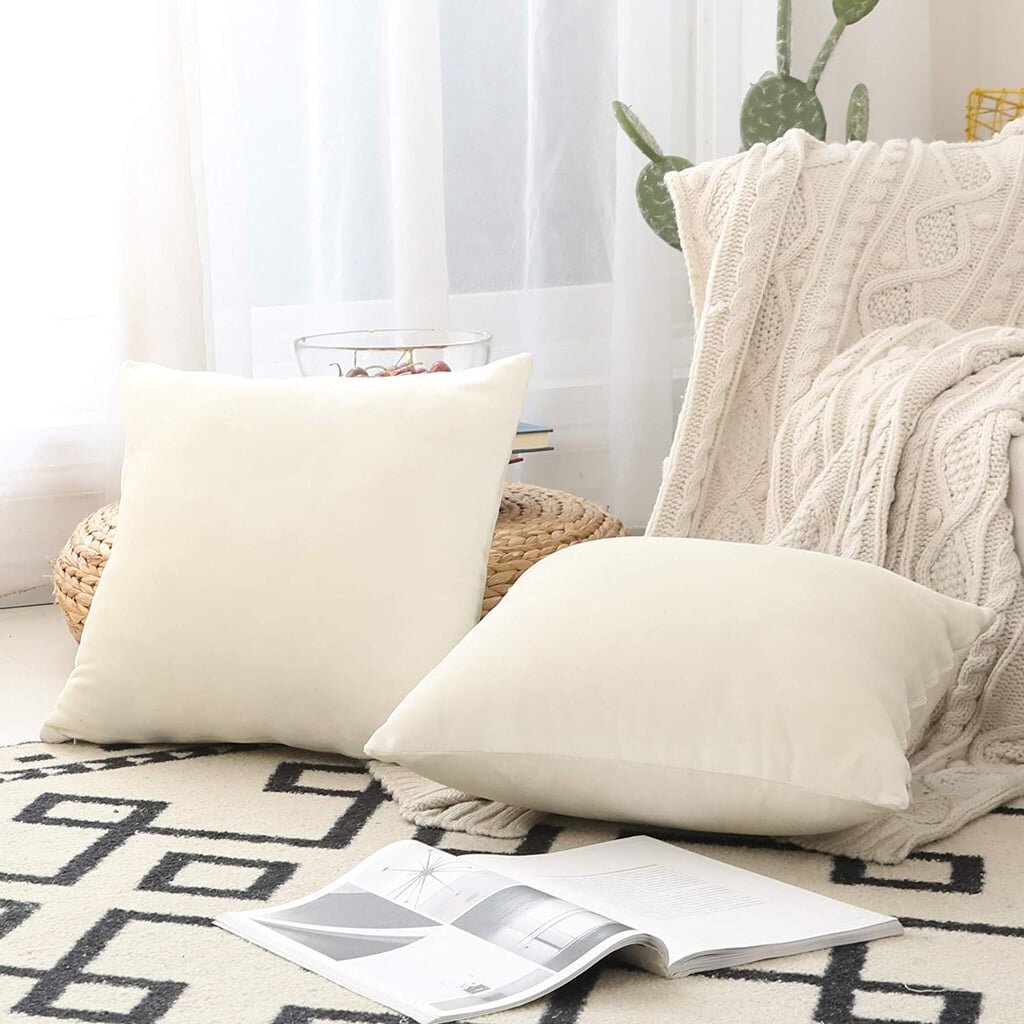


What textures best align with my brand?
Even in digital spaces, textures are important augmentations for a color palette. Some flat colors can look uninspiring even with good composition, but texture overlays are a strong but subtle way to engage the eye without being overwhelming.
Textures also communicate secondary experiences like warmth, weight, and material association.
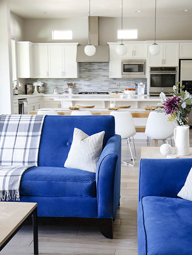
What temperature should my palette lean towards?
Speaking of warmth be sure to investigate what temperature you want your palette to communicate. Warm colors like red, orange, and yellow create a different mood compared to their colder counterparts in blue, grey, white, and violet.
Luxury brands can occupy this entire spectrum, provided that there is a clear brand identity and consumer experience to build around.
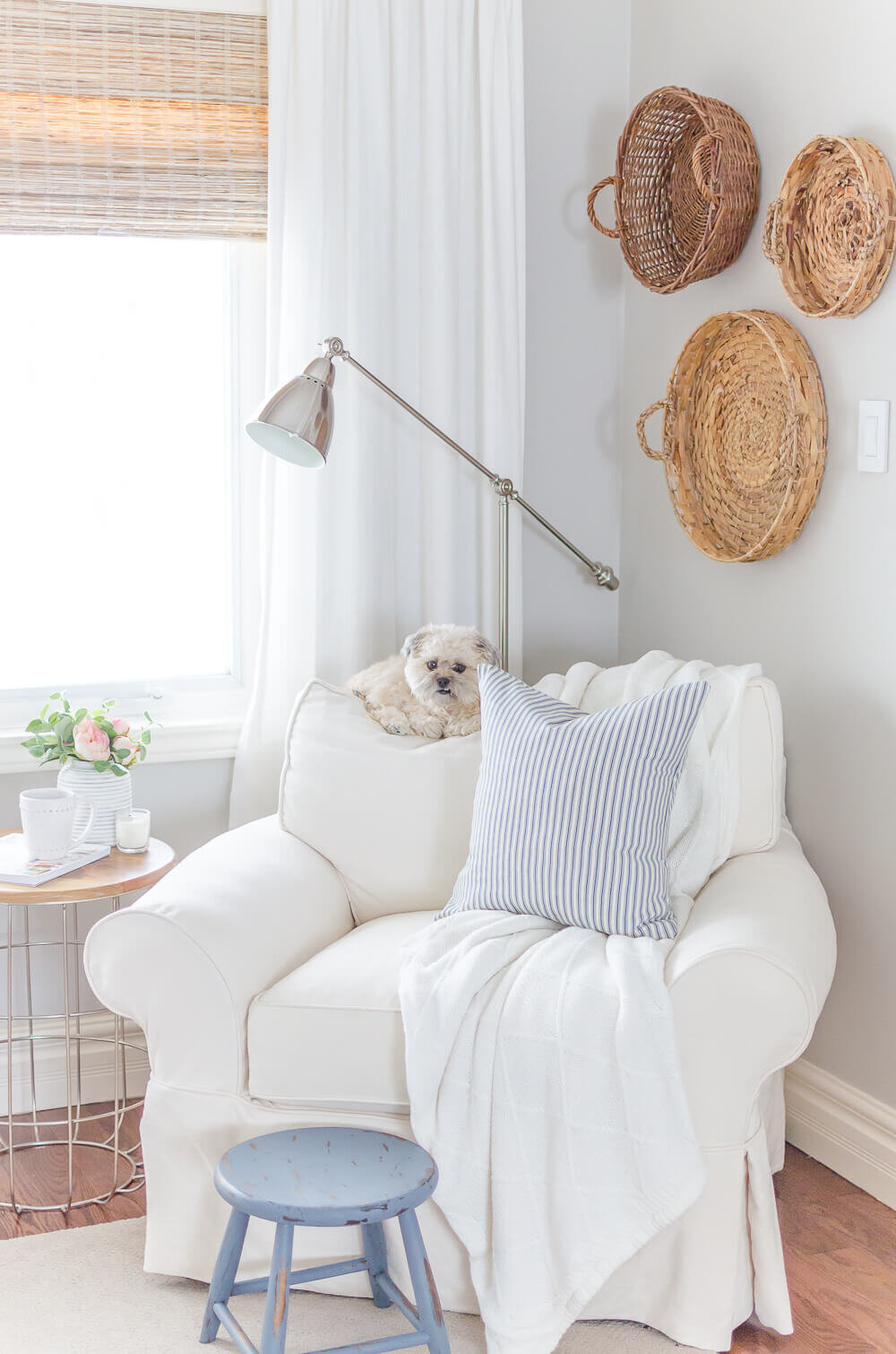
What alternative scheme compliments my primary one?
Just as the colors on either side of the temperature spectrum can shift a mood, so can neutrals. Brown, green, and taupe are not only effective colors for the right brand identity in their own right, but their neutrality translates well to a secondary color scheme to complement the primary brand palette.
Ready to get started?